


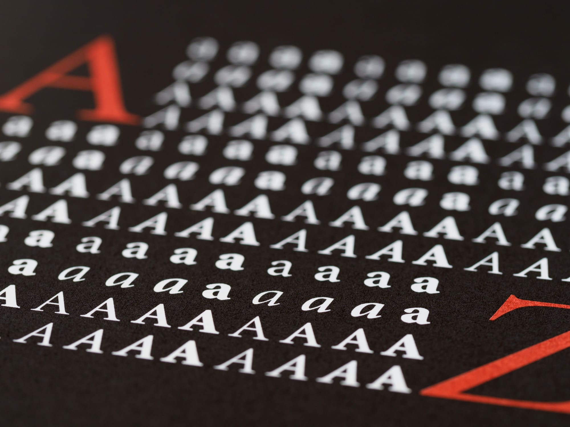
When people think about great digital design, they often focus on visuals, colors, or layouts.
Yet one of the most influential design elements is typography.
Every article, newsletter, blog post, and publication depends on typography to communicate ideas effectively. Readers spend far more time interacting with text than any other element on a page.
Good typography goes unnoticed.
Bad typography becomes a distraction.
For publishers, creators, and designers, understanding typography is essential for creating content that people actually enjoy reading.
Typography Is More Than Choosing a Font
Many people assume typography begins and ends with selecting a typeface.
In reality, typography is the complete system that determines how text appears and behaves across a publication.
This includes:
- Font selection
- Font size
- Line height
- Letter spacing
- Paragraph spacing
- Content width
- Visual hierarchy
- Contrast and readability
Together, these elements influence how comfortable content feels to read.
The goal is not simply to make text look attractive.
The goal is to make reading effortless.
Why Readability Matters
Readers make decisions quickly.
Within seconds of landing on a page, they determine whether content feels approachable or overwhelming.
Poor typography can create friction that discourages engagement before the reader even begins.
Common readability problems include:
- Text that is too small
- Lines that are too long
- Insufficient spacing
- Weak contrast
- Excessive font variations
- Crowded layouts
Even valuable content can lose readers if the reading experience feels difficult.
"Typography should support the message so effectively that readers focus on the ideas, not the design."
The Importance of Visual Hierarchy
Every article contains different levels of information.
Headings, subheadings, body text, quotes, and supporting content all serve different purposes.
Visual hierarchy helps readers navigate information efficiently.
A strong hierarchy typically includes:
Headlines
Designed to capture attention and communicate the primary topic.
Section Headings
Used to organize content into logical sections.
Body Text
Optimized for long-form reading.
Pull Quotes
Used to highlight key ideas and create visual rhythm.
Supporting Elements
Lists, captions, and metadata that provide additional context.
Without clear hierarchy, content becomes harder to scan and understand.
Choosing Fonts for Digital Publishing
The best publishing fonts prioritize readability over novelty.
A publication's typography should reinforce its brand personality while remaining comfortable for extended reading sessions.
Popular characteristics of effective editorial fonts include:
- Clean letterforms
- Balanced spacing
- Strong readability at multiple sizes
- Excellent performance across devices
- Clear distinction between characters
Many successful publications rely on only two font families:
- One for headings
- One for body text
This approach creates consistency while maintaining visual interest.
The Ideal Reading Width
Line length significantly affects reading comfort.
Lines that are too short create excessive eye movement.
Lines that are too long make it difficult for readers to locate the next line of text.
Most modern editorial websites use a moderate content width that balances readability with visual aesthetics.
Well-designed reading experiences prioritize:
- Comfortable line length
- Generous white space
- Clear content structure
- Consistent alignment
These small decisions contribute to a more enjoyable experience.
The Role of White Space
White space is often misunderstood.
It is not empty space.
It is an active design tool.
Proper spacing improves:
- Readability
- Focus
- Content organization
- Visual balance
- User comprehension
Publications with generous spacing often feel more premium because readers can process information without feeling overwhelmed.
White space creates breathing room for content.
Typography and Mobile Reading
Mobile devices now account for a significant portion of digital reading.
As a result, typography must perform well across multiple screen sizes.
Mobile-friendly typography typically includes:
- Larger body text sizes
- Increased line spacing
- Responsive content widths
- Clear tap targets
- Strong contrast ratios
Designers should test content across devices rather than relying solely on desktop previews.
The best reading experiences remain comfortable regardless of screen size.
Common Typography Mistakes
Even experienced designers occasionally overlook typography fundamentals.
Some of the most common mistakes include:
Using Too Many Fonts
Multiple typefaces can create inconsistency and visual confusion.
Prioritizing Style Over Readability
Decorative fonts often reduce reading comfort.
Ignoring Spacing
Crowded text creates unnecessary friction.
Weak Contrast
Poor contrast can make reading difficult, especially on mobile devices.
Inconsistent Hierarchy
Readers should immediately understand the structure of the content.
Avoiding these mistakes can significantly improve the quality of a publication.
Typography as a Brand Asset
Typography does more than improve readability.
It helps shape perception.
Readers often associate typography with professionalism, trust, authority, and quality.
Many iconic publications are instantly recognizable because of their distinctive typographic systems.
Consistent typography strengthens brand identity while creating a familiar reading experience.
Over time, it becomes part of the publication's visual voice.
Looking Ahead
As publishing platforms continue to evolve, typography remains one of the most important foundations of digital communication.
Technologies change.
Devices change.
Content formats change.
But readers will always depend on clear, readable text to consume information.
The best typography is not the most decorative or complex.
It is the typography that disappears into the background and allows the content itself to shine.
For publishers, designers, and creators, investing in typography is ultimately an investment in the reader experience.
And great reader experiences are what keep audiences coming back.
